Interrobang
- Naomi Kent
- Feb 6, 2016
- 2 min read
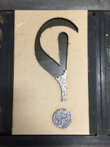
Here’s my submission for the interrobang exhibition at Ditchling art & craft museum I heard about through instagram. Now, I know its not about interrobangs but when I heard the title of the exhibition this idea came into my head, and when I have an idea I like to follow it through. The idea was to laser cut a large interrobang symbol and fill the shape with question mark and exclamation mark symbols. I looked through all the ? and ! symbols in the collection and it would have been a bit of a weird mish mash but most importantly, there wouldn’t have been enough. But then I began to wonder if Andrew at Carpathian type foundry could cast me all the ? and ! I needed. Unfortunately he was ill and unable to operate machinery but he did recommend Matt at paekakariki press. He was most helpful and willing to cast me the symbols I needed. I took a look through the fonts he could cast and started making the interrobang symbol out of them to see which would work best. I wanted the ? and ! to be the same font as the laser cut symbol. I quite liked the look of perpetua, so settled on that. “How many were you thinking” “I need 12pt, so about 100 of each” I said.
After our phone conversation i began to doubt whether 100 of each would be enough. We both did some calculations and crazily we both came up with the same amount of ! -2.
Using my highly technical and mathematical skills i divided the interrobang symbol into ems, and counted all the em spaces up. My initial estimate of 100 ? and ! each were massively incorrect.
I would need 432 ! and 768 ?

My symbols arrived within a couple of days, and I started to fill up the laser cut symbol on the bed of the press. To start with, the tiny 12pt symbols just kept falling over. I knew this was going to be a long process. Not only that but it felt like i wasn’t getting anywhere, that the space wasn’t filling up. I had to take photos to show myself that I was getting somewhere
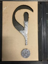
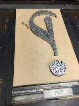
I can’t quite tell you the joy of seeing the completed symbol, and neither could my back after being bent over the press for about 4/5 hours.
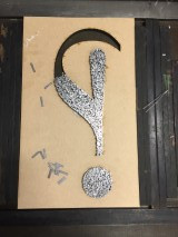
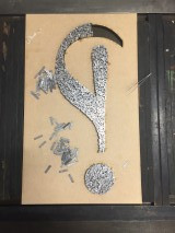
I pulled a proof, and as envisioned, there were unsightly gaps in places (I had used 12pt spaces too to bulk it out a little and to keep costs down) and also symbols that had lined up together. I then had to spend another couple of hours taking out extra spaces and undoing the orderly symbols to give it more of a scattered look. Trying to find certain symbols that i has circled on the proof in the type itself was a bit of a mission, its a 1,000 piece jigsaw puzzle!
Here’s the finished print, printed mainly on Bockingford smooth 300gsm


Like my colleague said, they look like ants.
Only one thing now remains, and that would be to diss about 700 pieces of spacing into ens, thicks, mids and thins. Anyone like to come help?


Comments